
Tables
Tables are at the center of your data asset hierarchy. When you select a table in the Explorer tree, tabs appear that let you focus on different aspects of the table's data quality.
Table Health tab
When you select a table, the Table Health tab provides an overview of the table’s metrics and data. If no metrics are set up yet, you can enable auto metrics using controls on this tab.
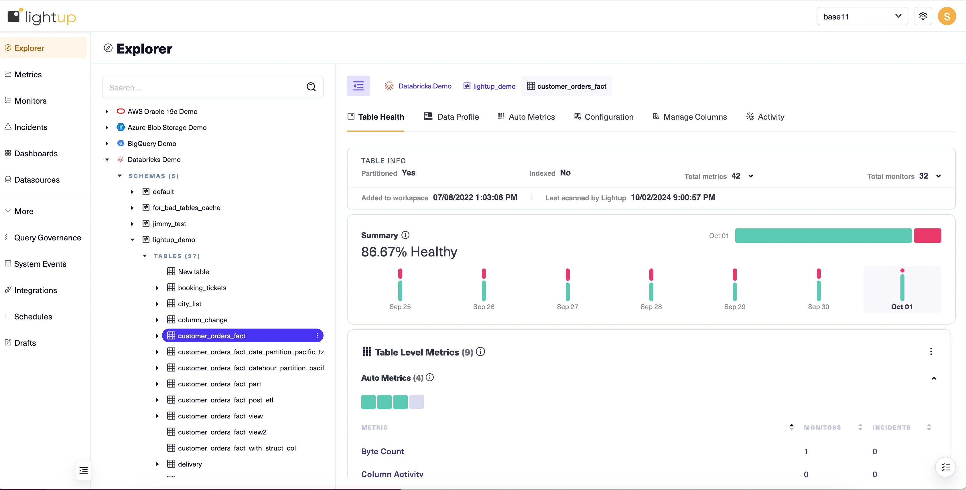
Summary section
If the table has any monitored metrics, the Summary section of the Table Health tab provides a visual indicator of their overall status for the most recent completed day: a % Healthy score, a green bar indicating healthy metrics and a red bar indicating unhealthy metrics (metrics with incidents), plus the percent of monitored metrics that are healthy. Only working metrics with live monitors affect this summary.
Below the horizontal bars, vertical bars indicate the summary for each day of the past week— the last bar corresponds to the most recent completed day. You can click a bar to select that day, setting the scope for the remaining sections. Note that the dates are displayed in your local time zone, while internally these values are in UTC.
Table Level Metrics section
The status of each of the table's metrics is indicated by a square at the top of the Table Level Metrics section: green squares for monitored metrics with no incidents, red squares for metrics with incidents, and gray squares for metrics that aren't producing health information— either the metric has an error or it doesn't have a live monitor. The status is as of the date currently selected in the Summary section (by default the most recent completed day). You can hover on a metric's square to see status details.
Below the squares, these metrics are also listed, with the number of monitors and incidents shown for each. You can click a square to focus on the corresponding metric in this section.
Auto metrics are listed even if they aren't enabled yet, and you can configure the table and enable its auto metrics from this section. User defined metrics appear in a section below the table's auto metrics.
Column Health section
Any columns that are configured appear in the Column Health section. If no columns are configured yet, there's a button you can click to start the configuration process. Each of the configured columns is represented by a square: green if the column has monitored metrics with no incidents, red if there are incidents, and gray if there are no monitored metrics. As with tables, the status is for the currently selected day in the Summary section. You can hover over a square to see how many metrics are set up for the corresponding column.
Table Info section
General information about the table appears in the Table Info section.
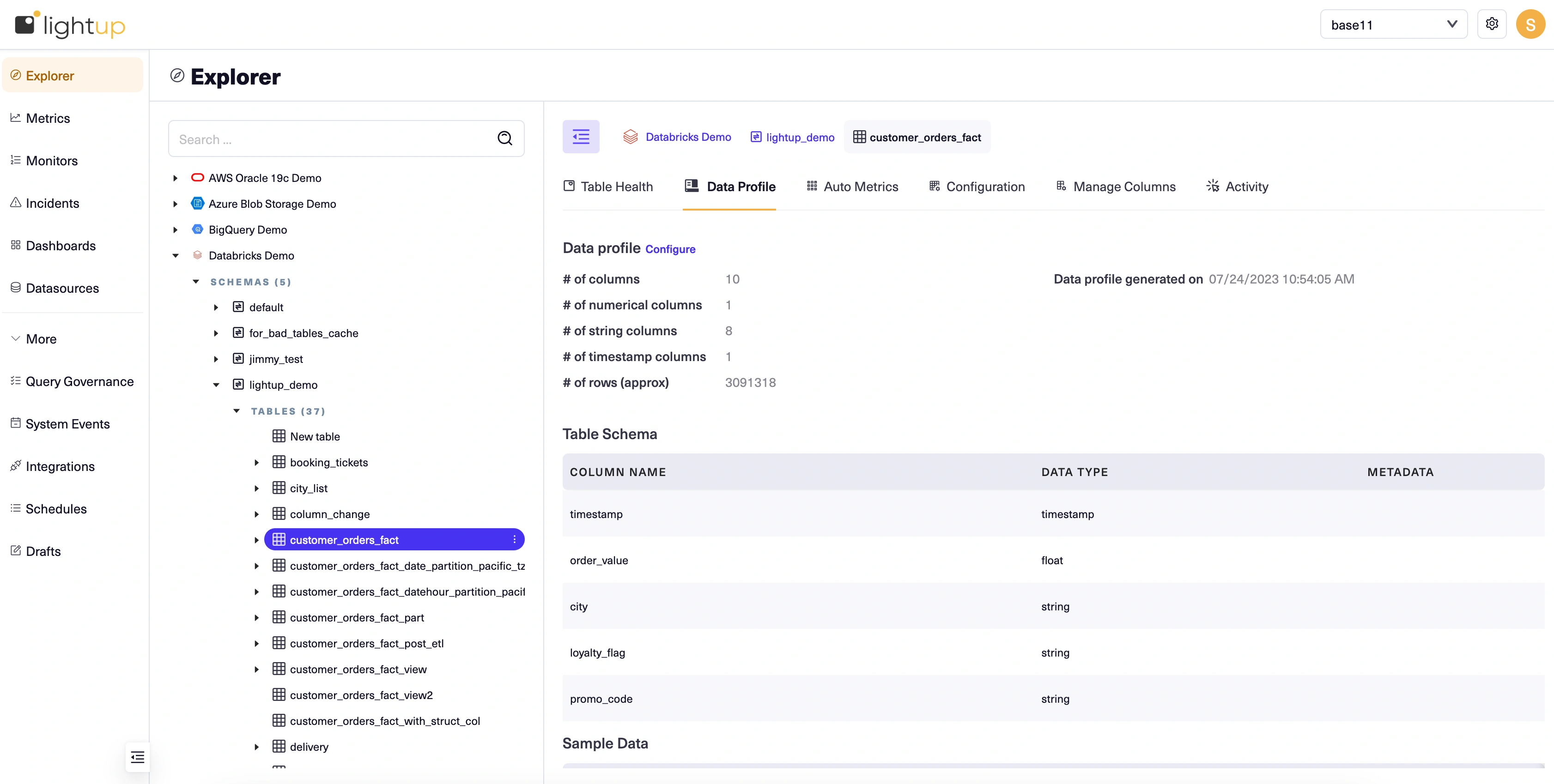
Data Profile section
If a data profile exists for the table, the profile appears in the Data Profile section. If not, a button that lets you set up the data profile appears instead.
Data Profile tab
On the Data Profile tab, you can enable the table's data profile, and you can review or update the data profile if it's already enabled.
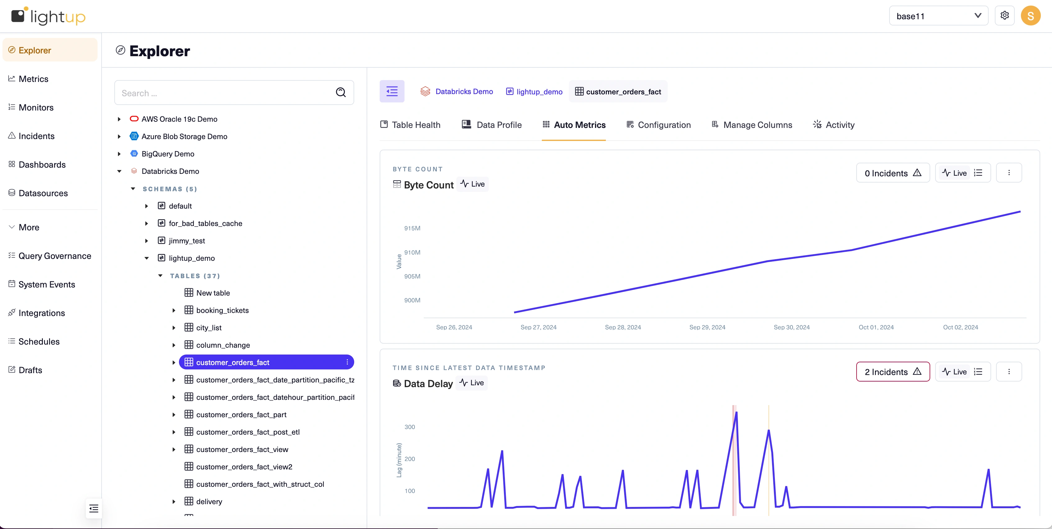
Auto Metrics tab
On the Auto Metrics tab, you can enable and monitor the table's auto metrics. You can also configure the table to enable deep auto metrics. Note that metadata metrics don't have history, so after you enable them you'll want to let them run long enough to generate sufficient datapoints before you add and train any monitors.
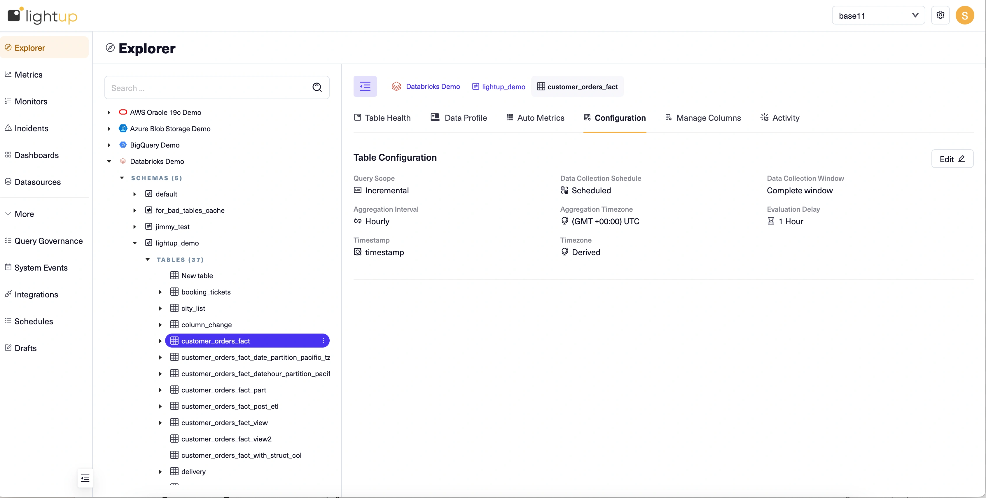
Configuration tab
On the Configuration tab, you can review and (if you have sufficient permissions) edit the table's configuration.
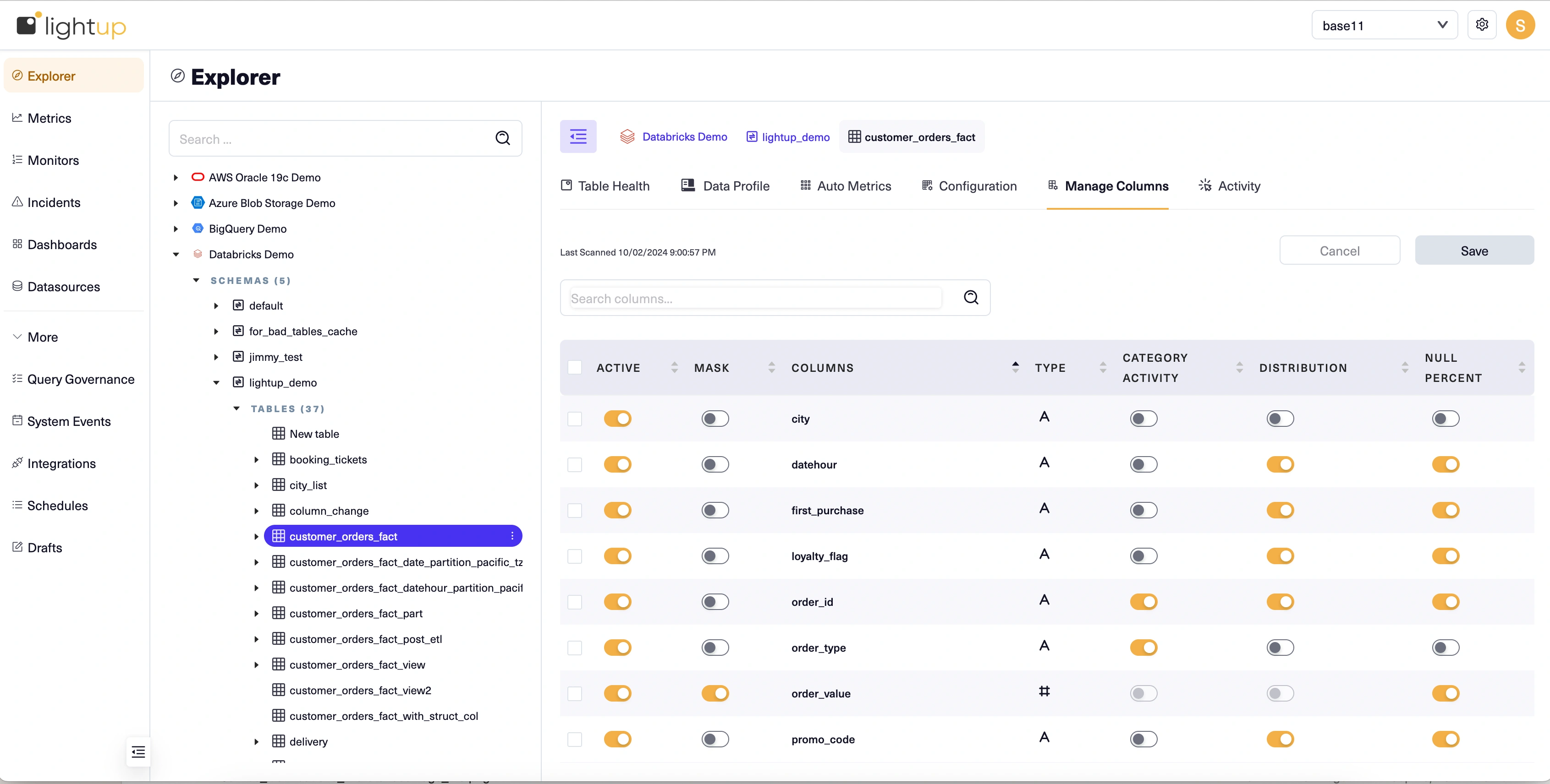
Manage Columns tab
On the Manage Columns tab, you can activate the table's columns and then enable their auto metrics.
Updated 11 months ago