
Quick Start
If you're new to Lightup this Quick Start will help you jump right in.
Get oriented in the UI
The Lightup app has three main areas:
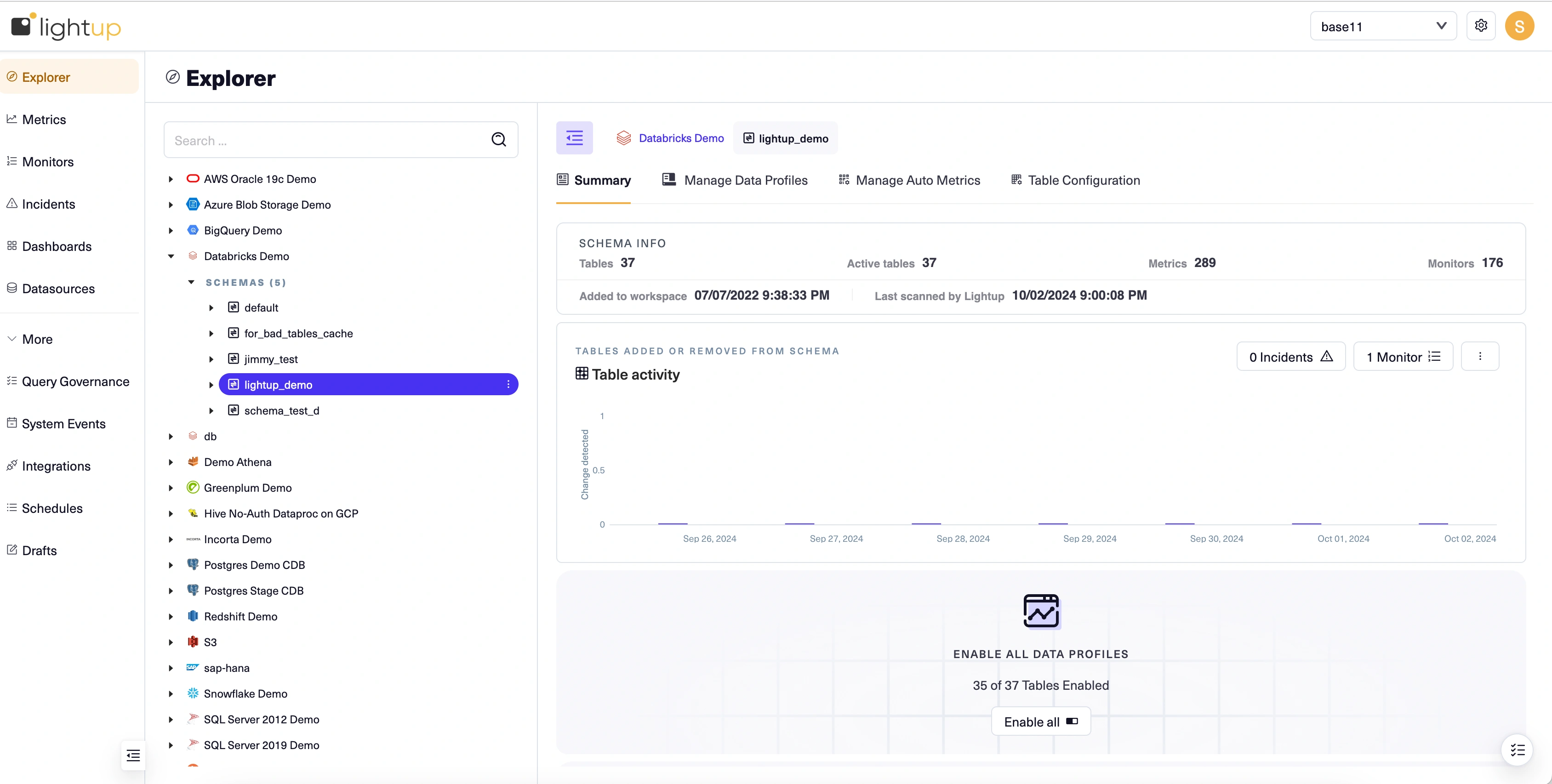
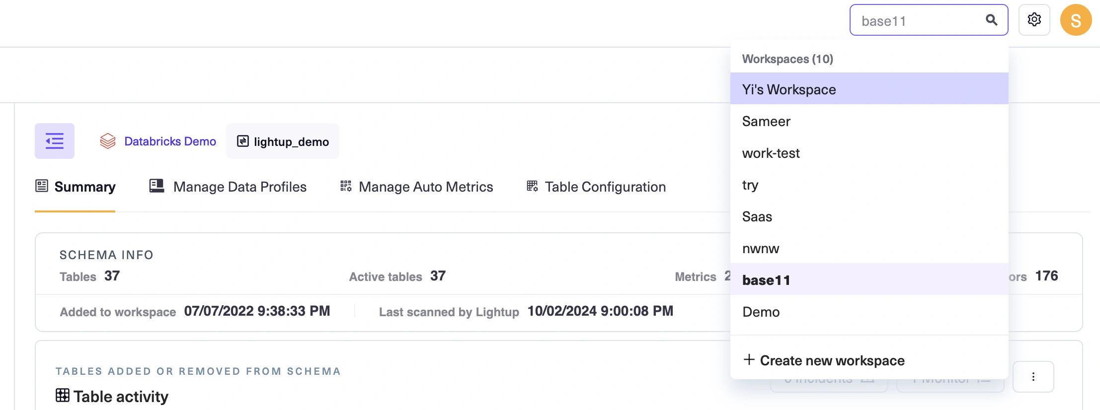
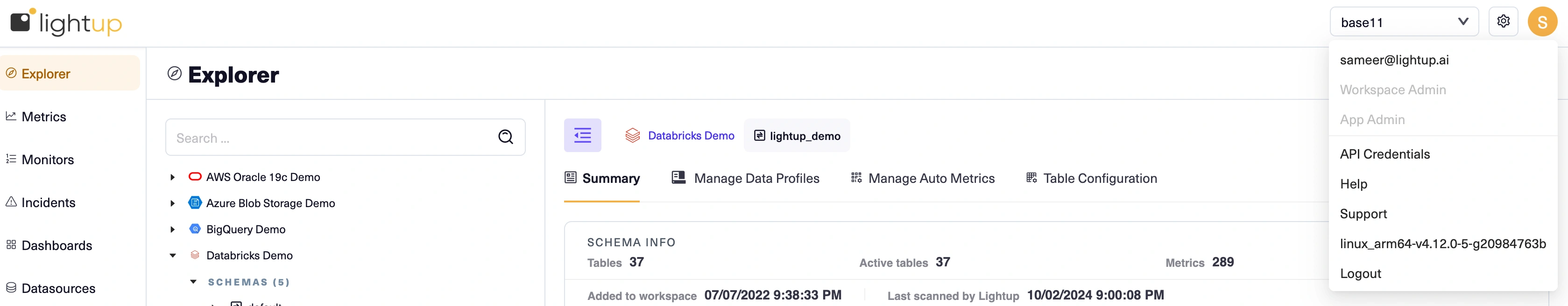
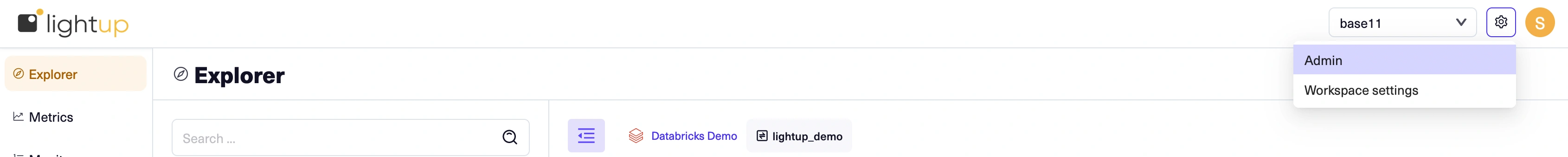
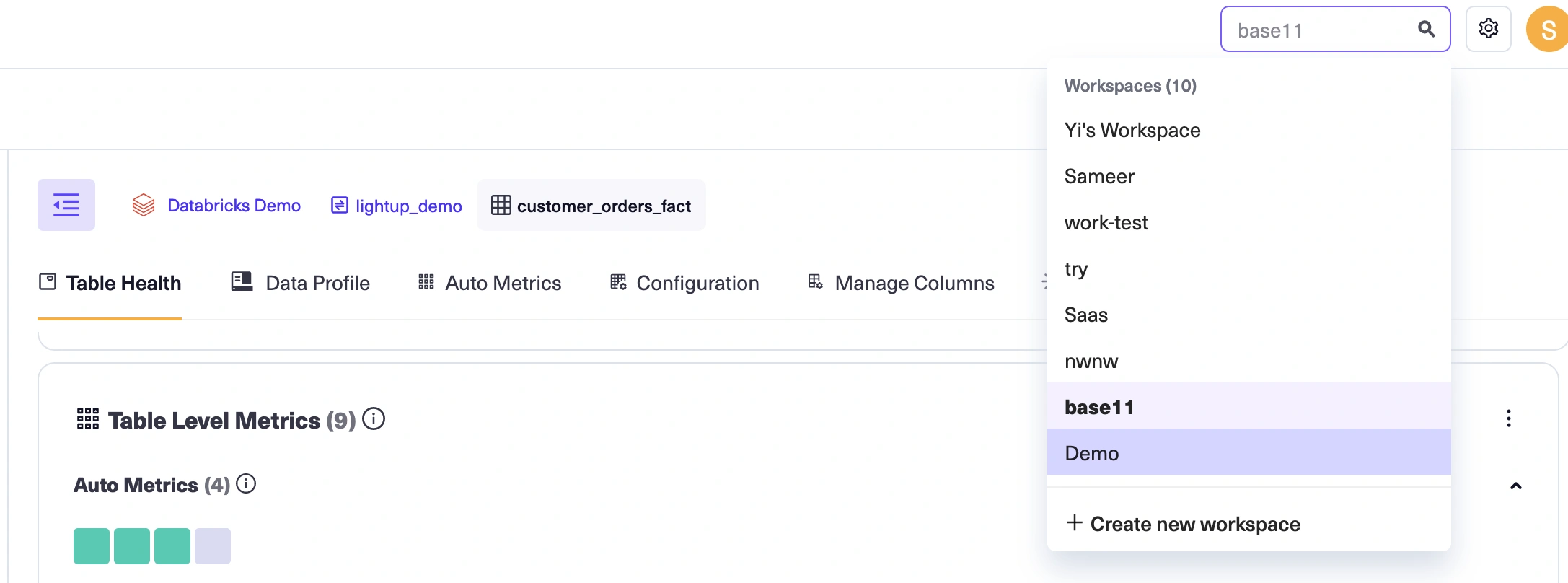
- The top bar has a workspace switcher on the right to switch between workspaces. Workspace and Admin settings can be accessed by clicking on the configuration icon next to the user name. Other user actions are possible via clicking on the user icon (such as contact support, generate API credentials, and logout)
- The left pane lists the menu of data quality related actions you will be interested in accessing for the workspace selected.
- The main page changes to reflect your choices on the left pane and the top bar. This is where you work with data quality components inside a specific workspace.
The top pane: Workspace switcher, Admin and workspace settings
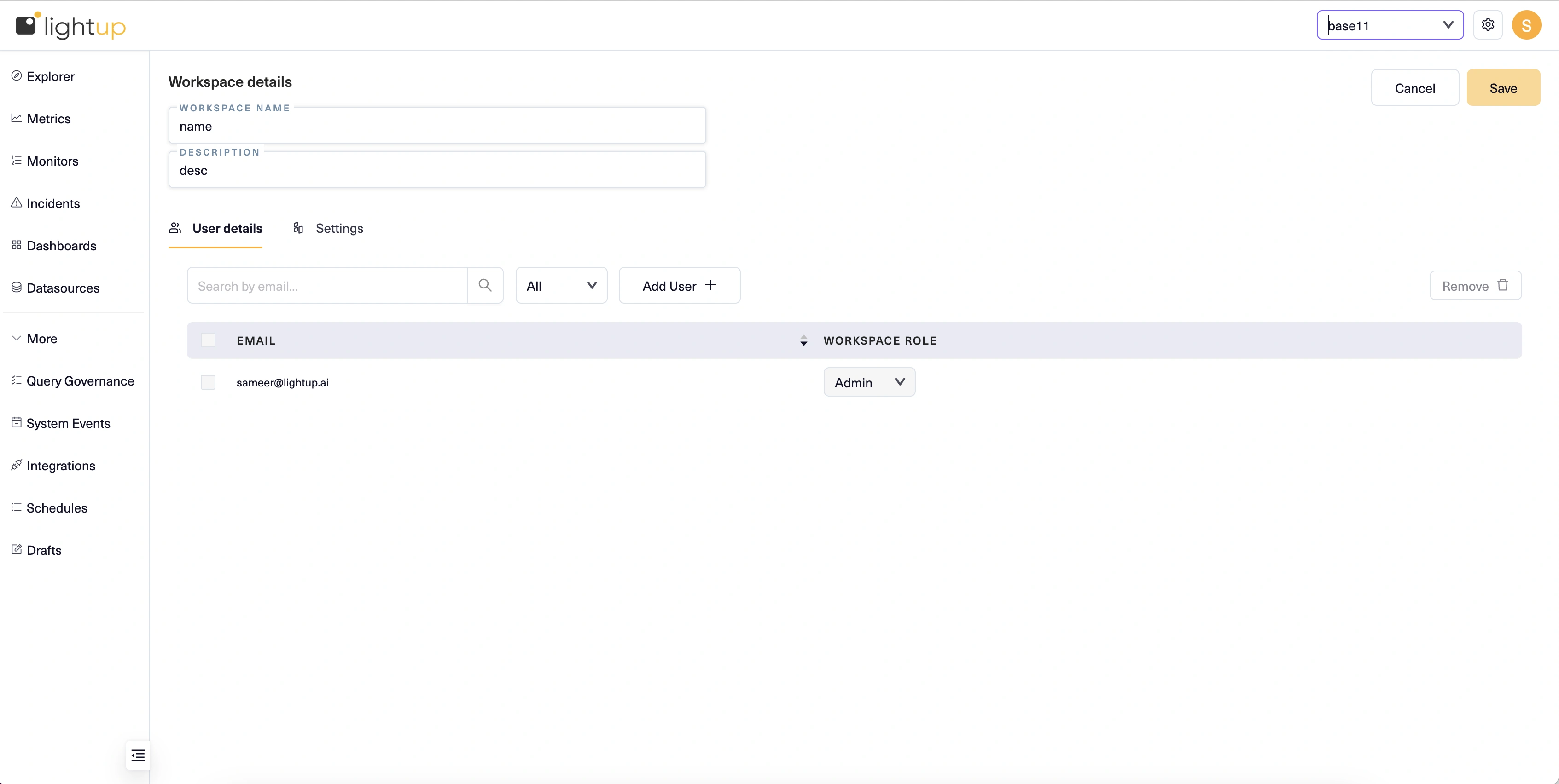
Your app role establishes what you can do outside of workspaces. Workspaces also have roles that determine what you can do inside of them. Look under the username icon to see which app role you have:
-
If you're an App Admin, you'll notice an Admin menu right under the app logo. As an App Admin you can create and manage Lightup user accounts, roles, and workspaces.
-
-
If you're an App Editor, you won't find an Admin setting, but you will notice the Add New Workspace in the workspace drop down. As an App Editor, you can create and manage workspaces, and can invite other Lightup app users to your workspaces. /im
-
If you don't have an Admin menu or an Add New Workspace button, you're an App Viewer. You can be invited to join a workspace. In the left pane, you'll see a list of workspaces where you're a member. Select the arrow at the right edge of a listed workspace to open a menu of commands for that workspace.
The left pane: navigation
The top bar offers a set of tabs you can select to focus on a specific quality monitoring process in a workspace.
- Select Explorer to manage data quality while viewing your data asset structure in your Explorer tree, which shows all of the workspace's datasources.
- Select Metrics to focus on metrics (the aggregated, periodic queries that measure data quality).
- Select Monitors to focus on monitors (the regular checking of metric values).
- Select Incidents to review recent data quality incidents.
- Select Dashboards to open the workspace's data quality or incident dashboards.
The main page: get stuff done
All data quality work you do in the Lightup app you do in the main page. When you pick a workspace its Explorer tab appears in the main page, displaying a tree view of your data assets on the left and asset-focused tabs with data quality analysis tools on the right. This combination lets you quickly set up your asset hierarchy for data quality analysis and health monitoring, from datasources down to individual columns.
The following section walks you through the process of setting up basic data quality monitoring.
Start monitoring data quality
Note: you'll need at least the App Editor app role to follow along with all the steps in this section. If you're an App Viewer, you may still be able follow along with most of the steps, depending on your workspace role:
- If you have the Workspace Admin role in a workspace, you can start by connecting to a datasource.
- Or, if you have the Workspace Editor in a workspace that has at least one datasource connection available, you can start by adding schemas to Explorer.
Now that you know how Lightup is laid out, you may be wondering, "What do I do next?". Using Lightup is easy, but you have to start somewhere. The following series of examples walks you through the process of setting up a data quality indicator. Once you've learned that basic flow, you're on your way to implementing an always-on observability platform that's customized for your data and business use cases.
Create a workspace
The first step is creating the workspace where you'll set up your data quality objects— the data assets you will analyze, and the metrics and monitors you create to perform that analysis.
-
On the top pane, select Create new workspace from under the workspace switcher drop down.
-
On the New Workspace page, enter a Workspace Name and Description.
-
Select Save at the top right corner.
Connect to a datasource
To begin adding your data assets, you connect to a datasource— a source database. Note that the source database must be prepared before you can connect to it. These preparatory steps are provided and need only be performed once per source database.
You must have the Workspace Admin role to connect to a datasource, or to edit an existing datasource connection. After you connect to a datasource it becomes available to others for data quality analysis.
A datasource exists within a workspace— it points to a source database. You can add a datasource connection in each workspace where you need it. This allows people working in different workspaces to independently analyze and monitor the same source databases.
Each type of datasource has its own inputs required for connecting to it. For steps, see the datasource's page in the following list.
- Amazon S3 bucket (Beta)
- Athena
- Azure Blob Storage (Beta)
- BigQuery
- Databricks
- Dremio
- Greenplum
- Hive
- Incorta
- Microsoft SQL
- MySQL
- Oracle
- Postgres
- Redshift
- SAP HANA
- Snowflake
- Teradata
For example, here's how to connect to a new datasource using a Postgres database that's already prepared, with an example shown for a datasource connection in the Plans & Budgets workspace.
- In the left pane, open a workspace menu and select Datasources.
- In the main page select Create Datasource +.
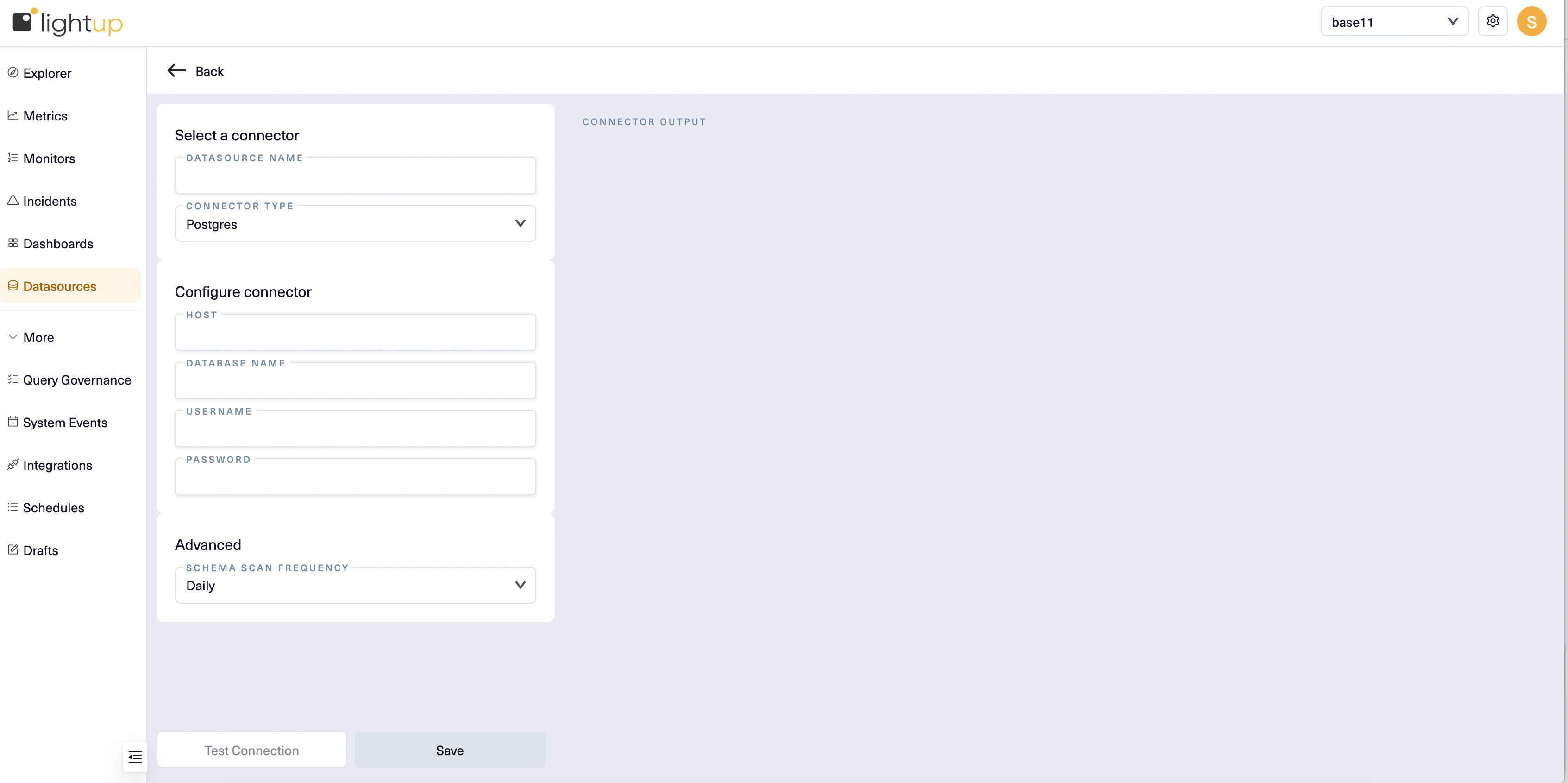
- Enter a Datasource Name, then for Connector Type select Postgres.
- Under Configure connector, provide the following inputs:
- Host Name - The hostname for the datasource (check the browser address bar; you want the string between // and /). Example:
https://host.na.me/ - Database Name - The name of the database you're connecting to. Each datasource can only connect to one database. If you need to connect to more than one, you'll need to create a datasource for each.
- Username - Enter lightup.
- Password - The username account's password.
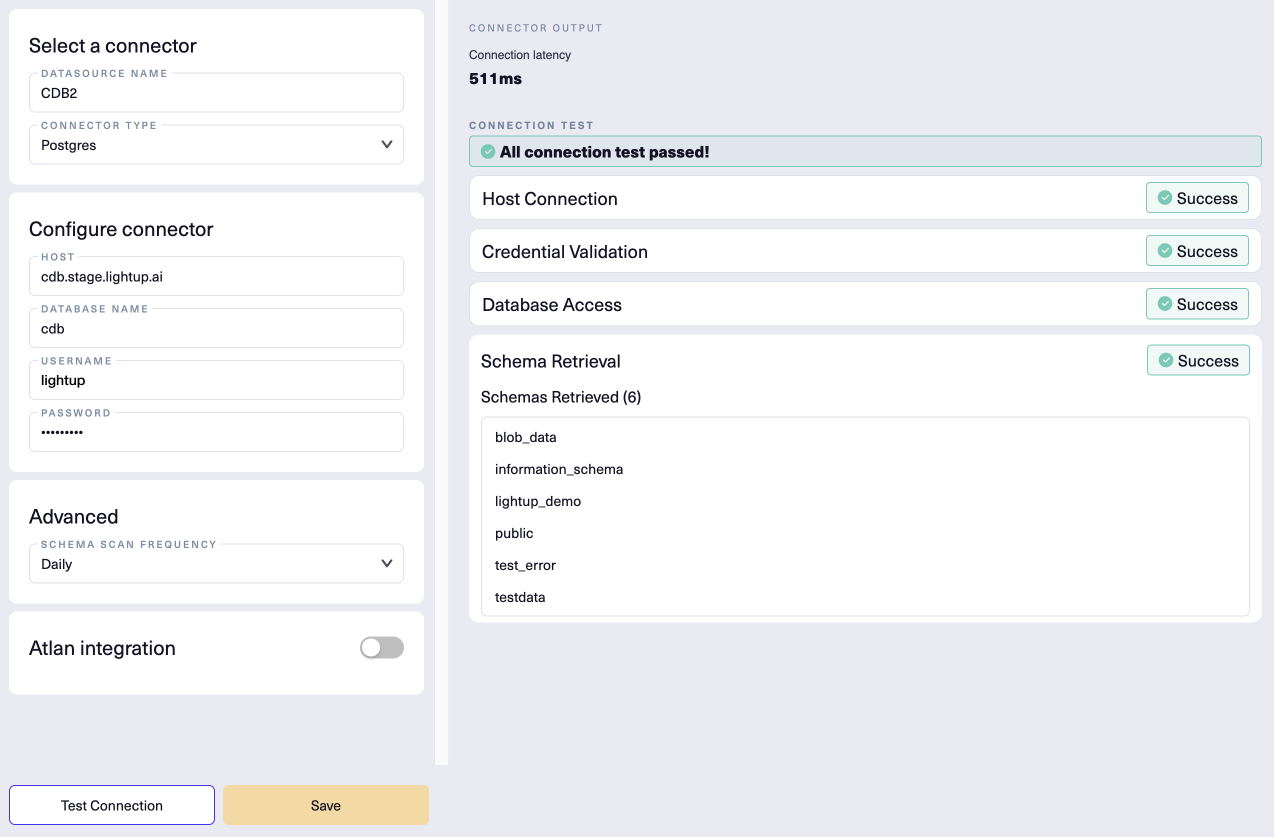
- After entering the required settings and any optional settings that apply, below the Configure connector section select Test Connection.
- After a successful connection test, select Save.
- Your new datasource appears in the list of available datasources. By default, these are listed in alphabetical order, so you might have to scroll or change the sort order to see your new datasource.
Here's our example new datasource connection, successfully tested:
Add schemas to Explorer
After you have a datasource, its schemas must be added to Explorer so you can begin data quality monitoring.
- Select the datasource in the Explorer tree.
- In the main page, select the Manage Schemas tab.
- Turn on the Active toggles for each schema that has data you want to monitor.
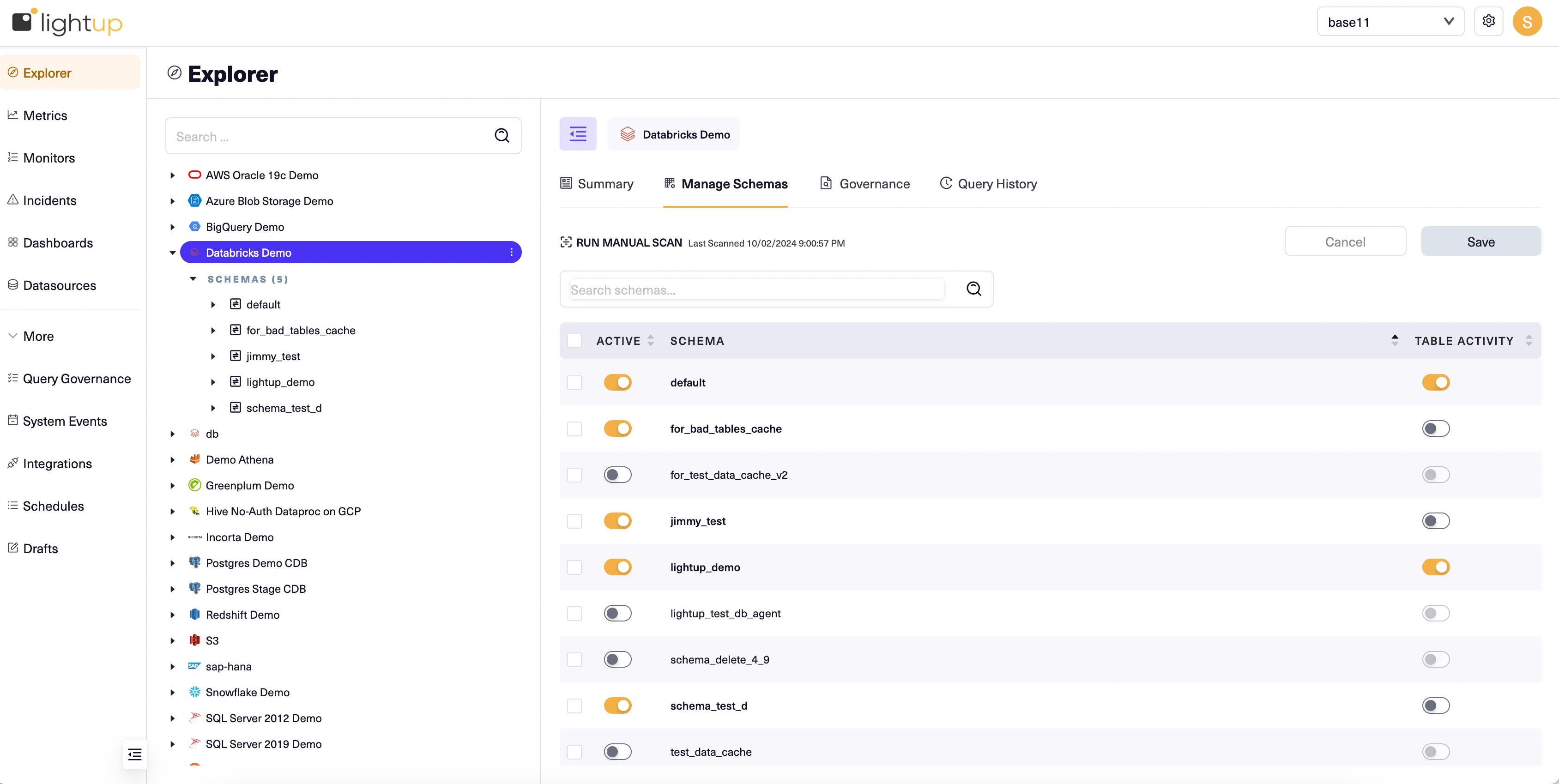
Note that each schema is scanned when you activate it, which can take some time to complete.
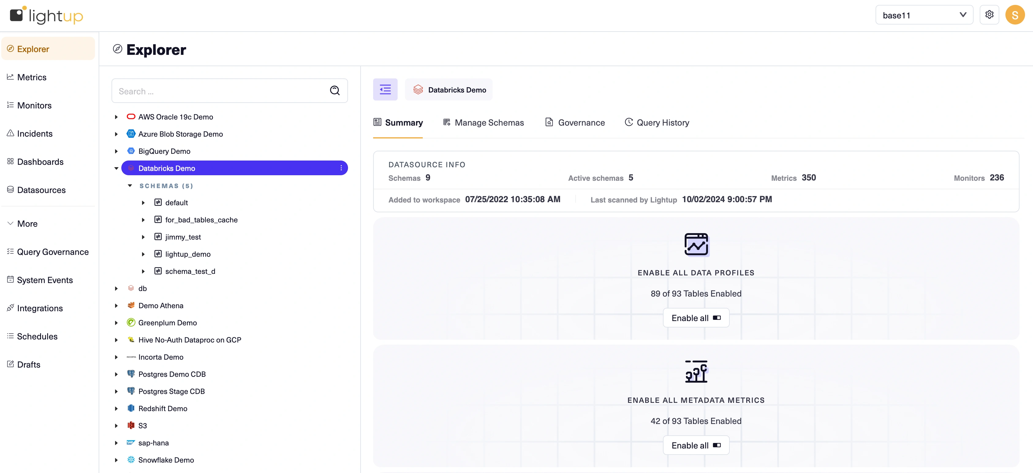
Set up data profiles
To better understand your data and help enhance your data quality analysis, enable data profiling. Data profiling provides a static analysis of your tables that you can view in the Explorer tree. Data profiles are currently generated only for string, numeric, and time-oriented columns. Other data types such as boolean will be absent from the results.
You enable data profiling when you add data assets to Explorer. The initial data profile uses up to one million rows to create each table's data profile, as follows:
- For a table with under a million rows, the data profile covers the entire table.
- If Lightup can determine which timestamp column to use for time-range queries and the table has at least a million rows, the data profile covers the latest 30 days worth of data.
- If Lightup can't tell which timestamp column to use for time-range queries and the table has at least a million rows, the data profile covers one million randomly-selected rows.
If you aren't sure what types of data quality checks you want, we recommend you enable data profiling to learn about your data. Reviewing these data profiles will give you the info you need to proceed with your data quality journey.
- Select the datasource in Explorer.
- On the Summary tab, select Enable All Data Profiles. This will create data profiles for all the tables in the schemas you added from the datasource, and may take some time.:
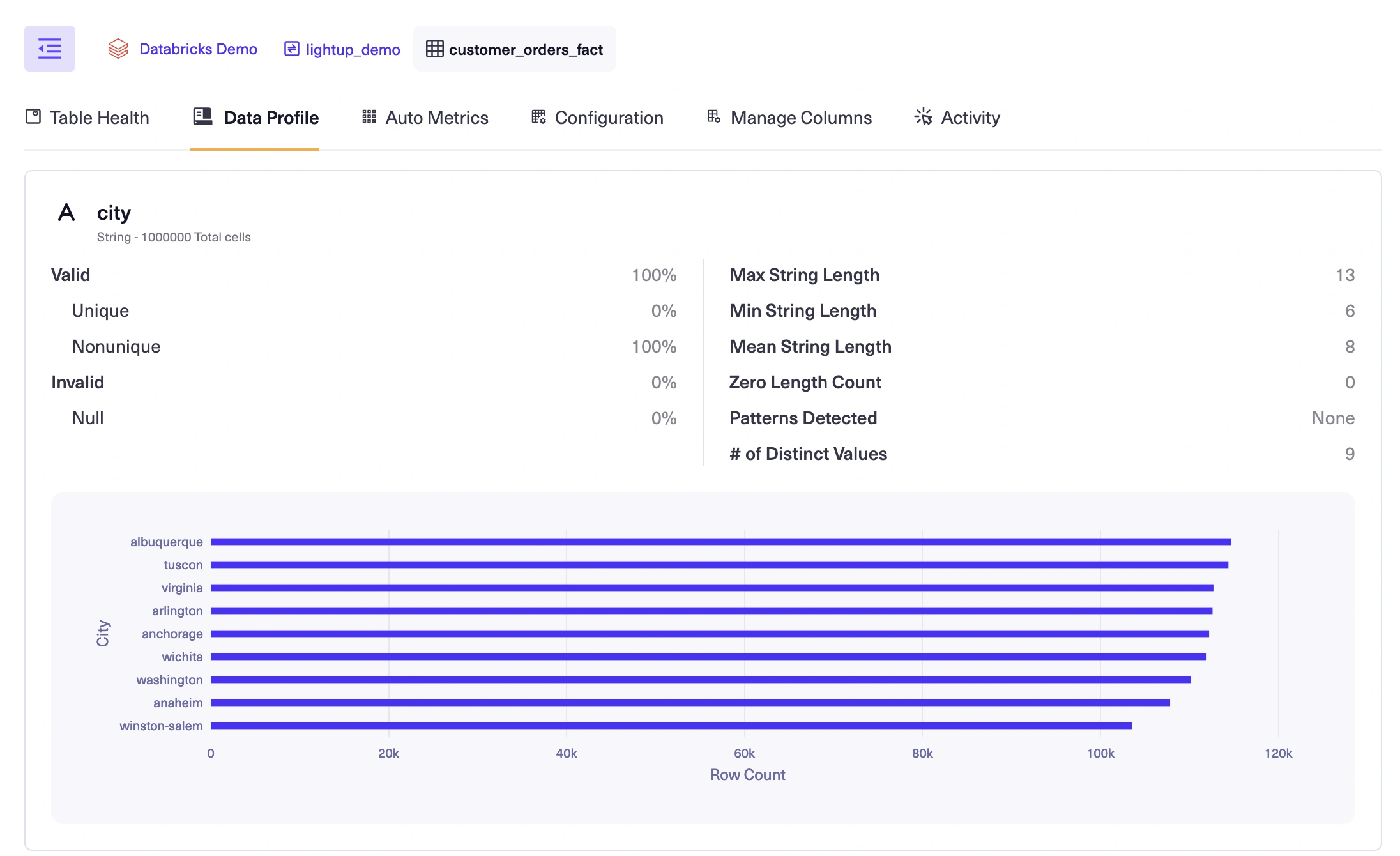
Review data profiles
After data profiles are generated, you can review them to help you plan your data quality analysis. For example, reviewing a table's profile will clarify which columns can be used for timestamps in metrics.
When you select a table in the Explorer tree, its Data Profile tab displays the table's current data profile:
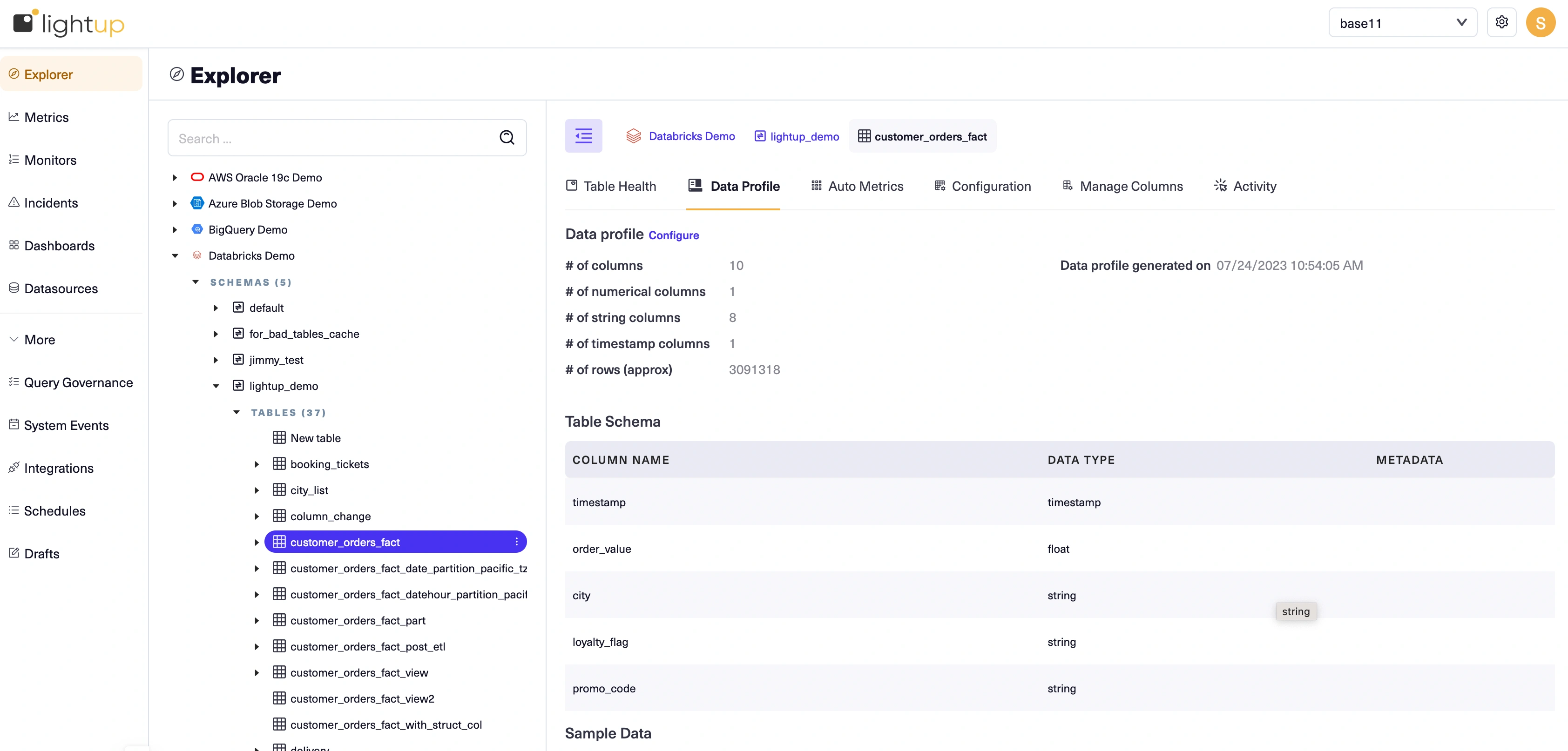
Each data profile is laid out in sections: Data profile, Table Schema, Timestamp Analysis, Sample Data, and profiled columns (section not labeled).
Review the sections of the data profiles to determine which tables you want to start monitoring. For more details, see Profile your data. Identify a table to focus on first, then proceed. :
- The Table Schema section shows the timestamp column, numeric value column and other columns making it suitable for any metric type..
- There are several other columns that are suitable for metric slices. Slices let you group by the values of a column in a metric to automatically create separate datapoints for each slice value.
- You can also view the detailed profile for each column.
Enable auto metrics
After you've identified a table, consider enabling its auto metrics.
Auto metrics provide a simple way to get started understanding your data quality. When you add data assets, you can enable their auto metrics. Lightup makes it possible for you to enable auto metrics at various levels in your data hierarchy, selectively or in bulk.
There are two kinds of auto metrics: metadata metrics that query system data, and deep auto metrics that query your business data.
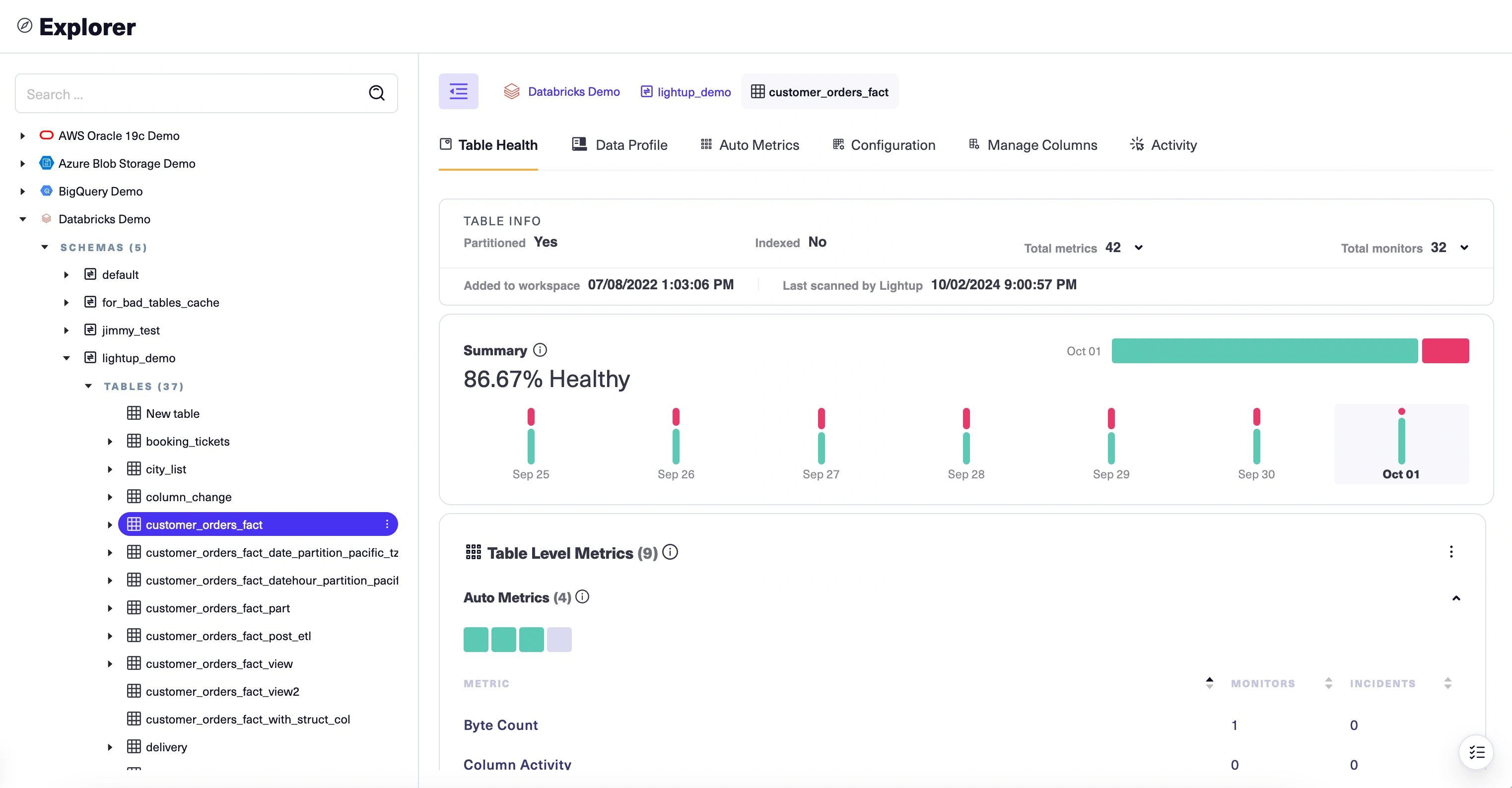
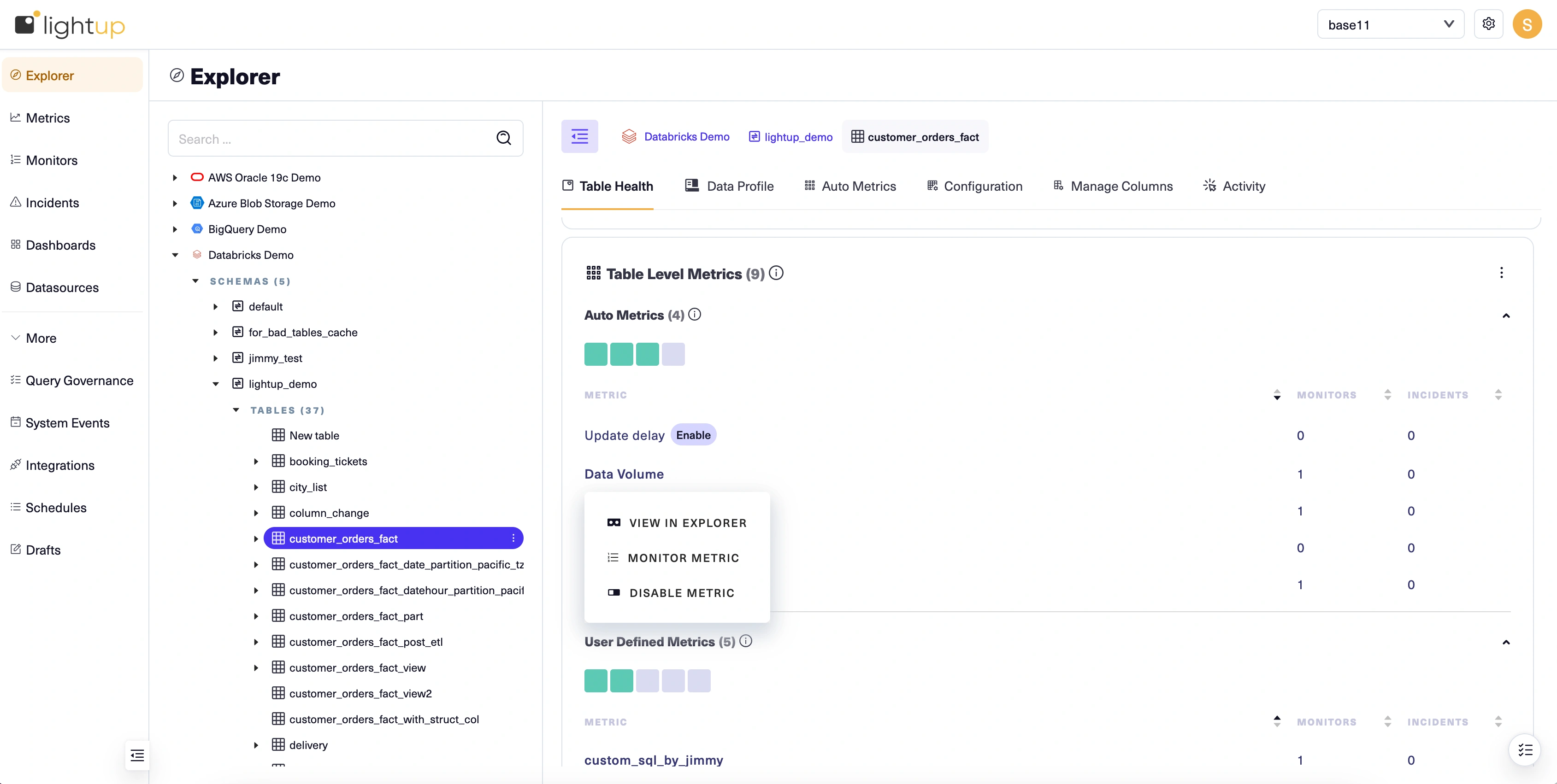
For our example, we'll enable all the auto metrics on the table we've identified. There are several ways to do so— we'll use the Table Health tab.
-
With the table selected in Explorer, select its Table Health tab.
-
Auto metrics are listed at the top of the Table Level Metrics section. To enable them:
- Select Enable beside the name of a metadata metric.
- Select Configure table beside the name of a deep auto metric— this is required because deep auto metrics query the table's data. Review the table configuration and make sure the fields are correctly populated, then click Confirm and save to return to the Table Health tab. Then, select Enable beside the name of the auto metric.
After you've enabled auto metrics, their names become menu links with three actions: View in Explorer, Monitor Metric, and Disable Metric. Note that at first the auto metric health indicators— the boxes just below the Auto Metrics section label— are gray. This is because until you add at least one monitor to a metric, its health is unknown.
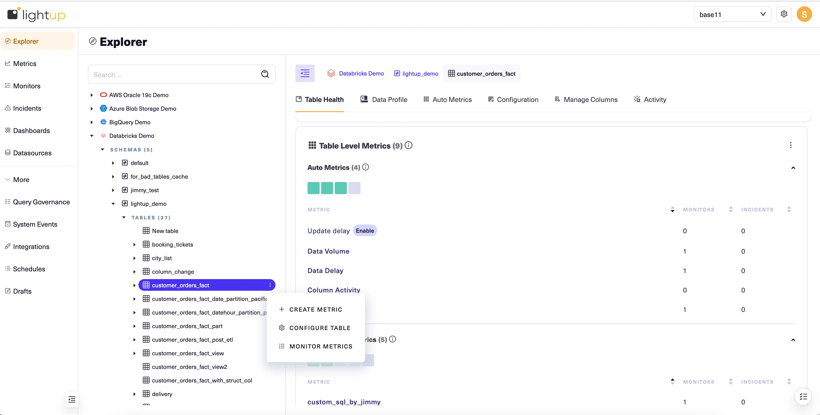
Create a metric
It's a good practice to add monitors to your auto metrics and let them run for a while to establish basic monitoring of the timeliness, accuracy, and completeness of a table's data before you begin creating your own metrics for it. To keep things simple for this Quick Start, we'll go ahead and create a simple aggregation metric that measures the table we configured.
-
In the Explorer tree, select the data asset that you want to measure.
-
On the asset's Explorer menu select + Create Metric:
-
A new metric opens at Step 1 of the metric configuration form. Under Metric Info, select Aggregation.
-
Enter a Metric name, then select Next at the top right. Step 2 (Configure Metric) appears in the main form.
-
Under Aggregation function, select Sum— you may have to scroll down or use the arrow keys to find it in the list.
-
Select Next. Step 3 (Preview) appears in the main form. Previewing your metric shows you what it would look like with the current configuration, but it's optional so we'll skip it.
-
Select Next. Step 4 (Related metrics) appears in the main form. You can add related metrics to make them available in your analysis of incidents from the metric you're creating. It's optional so we'll skip it for now. You can always edit the metric later and add related metrics then.
-
Select Save. The configuration form closes and your new metric opens in Explorer.
Add monitors
After you create a metric, you add monitors to detect when the metric value is out-of-bounds. The quickest way is to use the metric's Monitors menu. We'll use the following procedure to add a monitor to the metric we created.
- With the metric open in Explorer, select its Monitors menu.
- Choose + ADD.
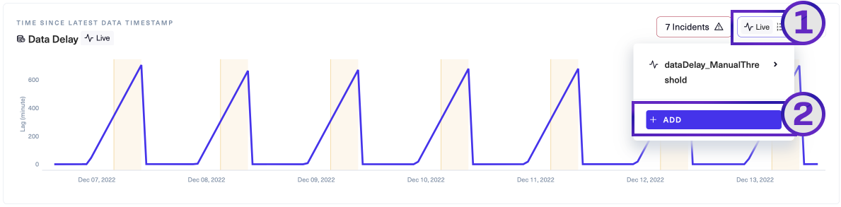
Lightup opens the Add monitor modal, which usually has two tabs: Threshold and Anomaly Detection (both tabs depicted below).
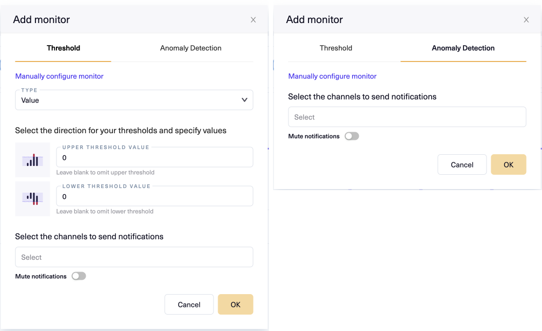 Note that some metrics do not support both tabs, because they don't support both underlying monitor types. For example, Compare metrics only support manual thresholds, so the Anomaly Detection tab does not appear in the Add Monitor modal for them.
- Select the Anomaly Detection tab, then click OK. Lightup adds a new monitor to the metric using the default settings for an aggregation metric.
Managing incidents
Congratulations! You've just prepared a data asset for data quality managment and created a monitored metric in Lightup. Because you chose to use anomaly detection, your monitor will intelligently determine when the metric's values are out-of-bounds and generate an incident accordingly. Because you just set it up, you won't have any incidents yet.
To learn more about handling data quality incidents, see Manage incidents and Analyze an incident.
Learn more about Lightup
Now that you've seen the basic end-to-end flow, you might want to learn more about your options:
Updated 11 months ago