
Charts
Metrics produce charts of the data they collect. These charts appear in several places to help you with data quality analysis:
-
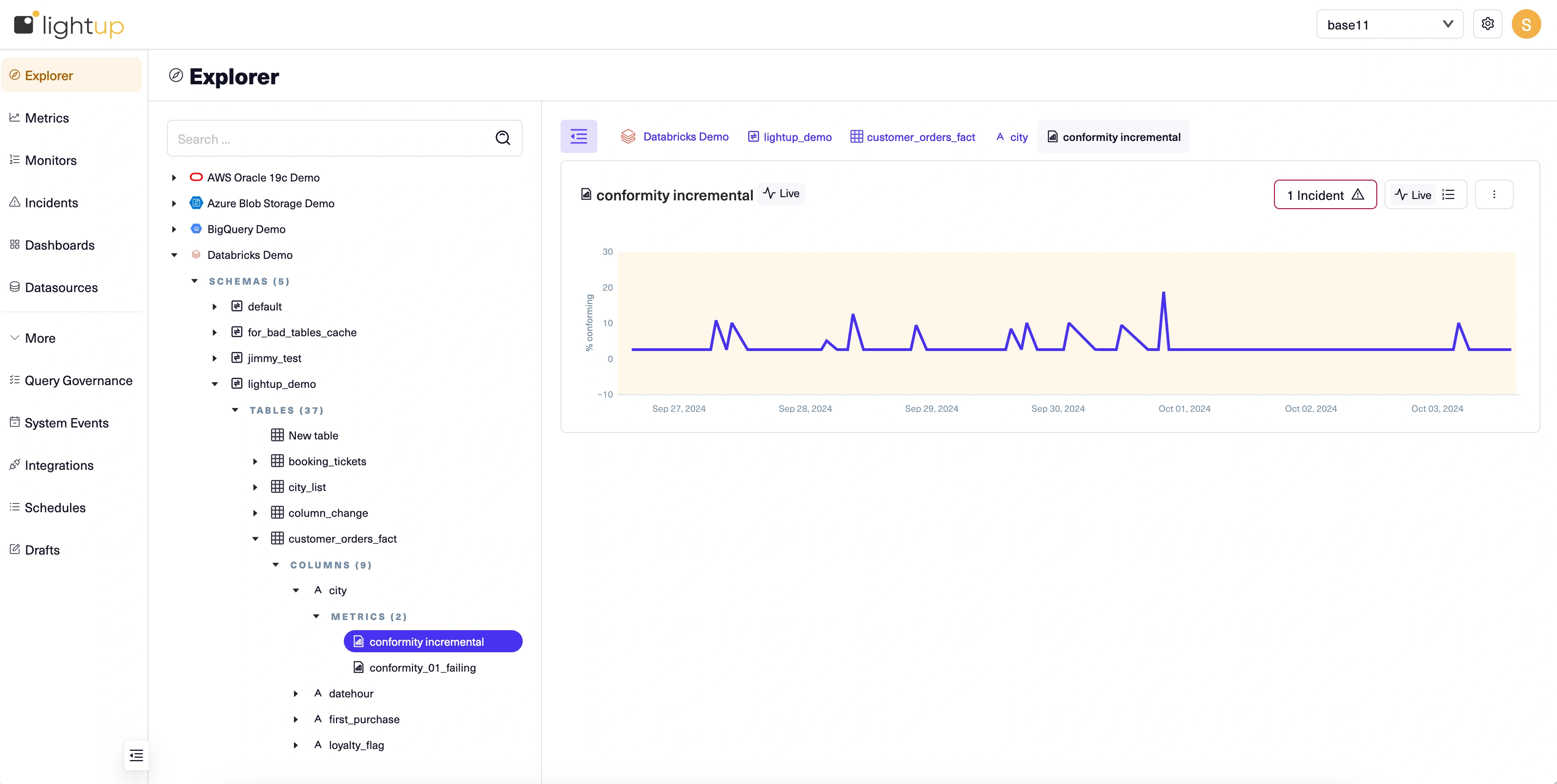
In the Explorer tree - When you expand a table in the Explorer tree, its metrics appear in the tree below it— select a metric in the tree to view its chart in the main page. In Explorer, a metric's chart includes menus for the metric and its monitors, and a button to open its incidents.
-
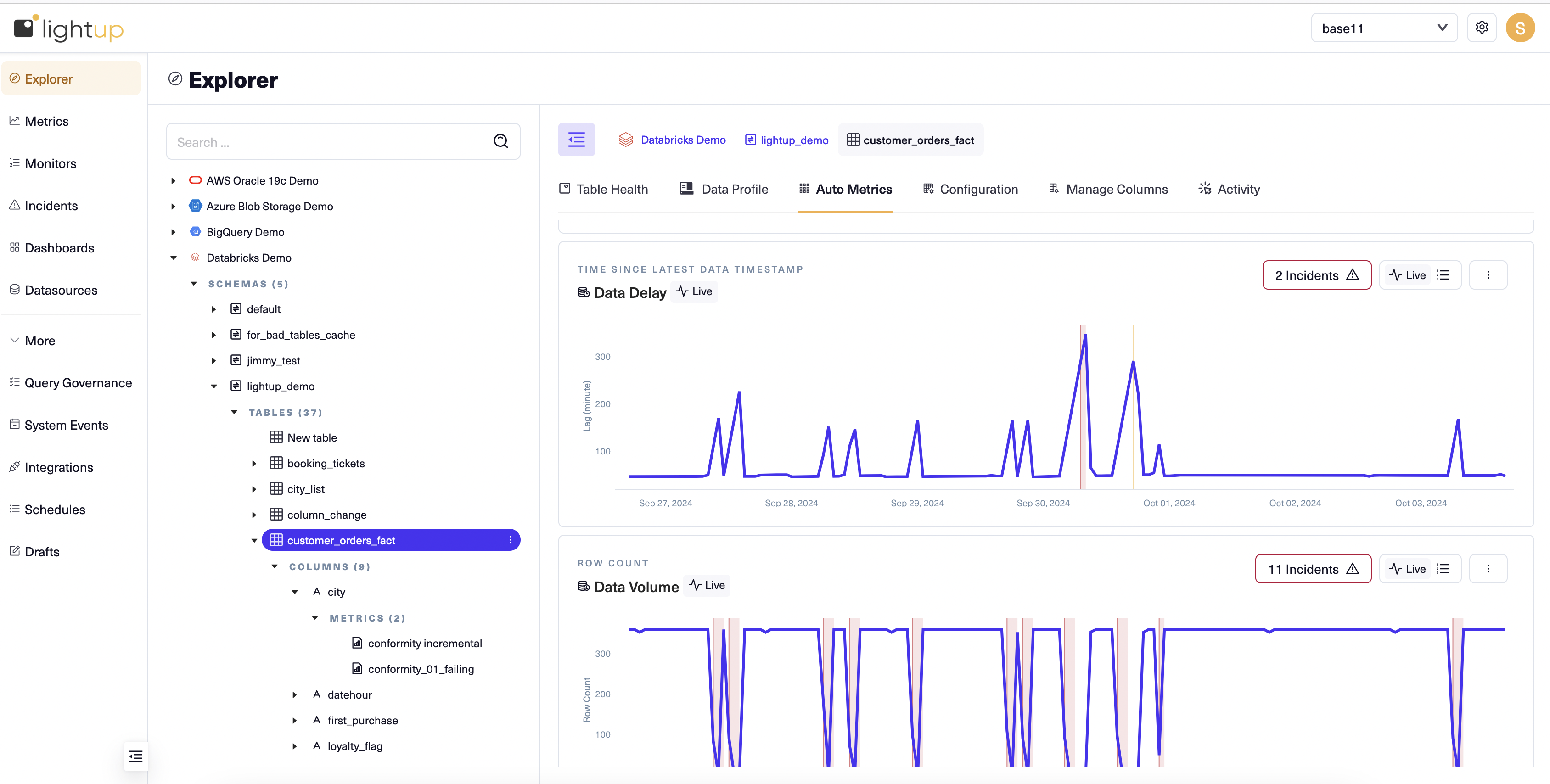
On a data asset's Explorer sub-tabs - When you select a data asset in the Explorer tree, some of the asset's Explorer sub-tabs contain metric charts. These charts also include menus for performing data quality analysis, such as the Expand Incidents button, the Monitors menu and the Metric menu on the Data Delay metric chart depicted below.
-
In incidents - When you open a metric's Incidents menu, the metric's chart appears with all incidents marked, and also listed below the chart in a table. When you open an incident's details, the metric's chart appears on the incident's Chart tab. The metric's chart also includes menus to help you analyze the incident. If you add Metrics of Interest, their charts also appear on the Chart tab, below the chart of the incident's metric.
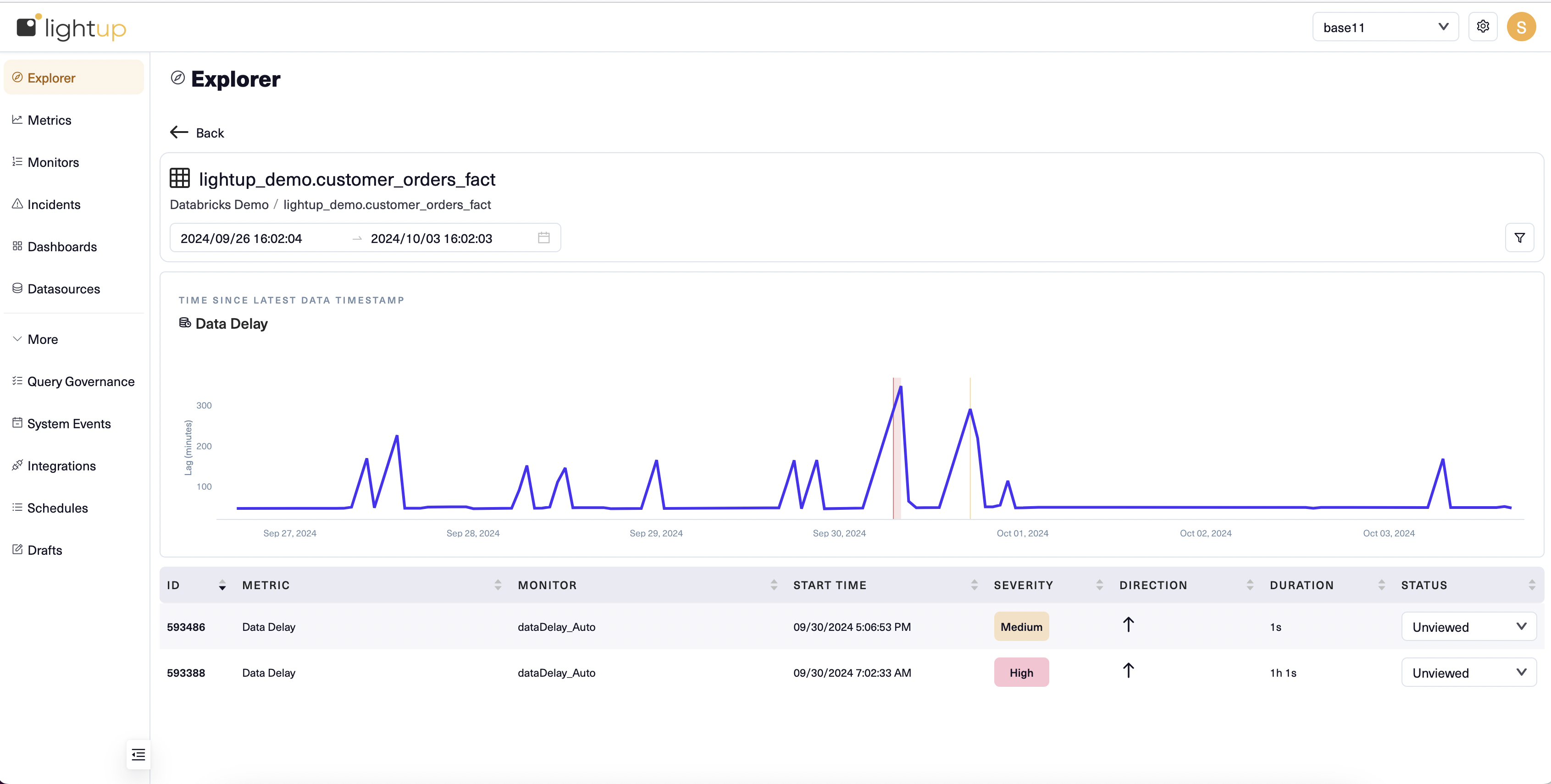
Chart elements
All metrics except for comparison metrics have charts with an x-axis and a y-axis. Except for distribution metrics (which have multiple values per timestamp), each datapoint on a metric chart shows the metric's value at a point in time. For metrics with Incremental query scope, each datapoint is the metric value at a specific timestamp. For Full Table metrics, no timestamps exist, so datapoints show metric values at the time data was scheduled for collection.
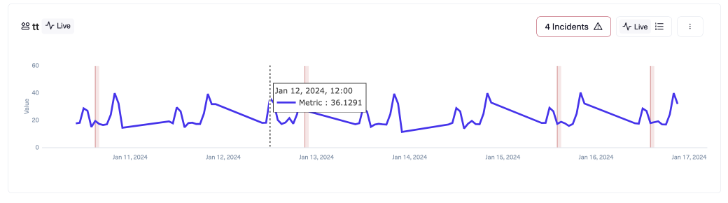
Chart axes
The x-axis corresponds to time: the timestamp for Incremental metrics, and the scheduled collection time for Full Table metrics. Labels indicate the date of each datapoint.
The y-axis corresponds to the metric's values. On the left, these values are labeled to specify what is measured (in the preceding image, Value). On the right, if the chart includes monitor thresholds the label indicates the monitor type.
Datapoints
A datapoint displays the metric value at a point in time. As depicted above, you can hover on a datapoint to see the value and time. Datapoints are connected to form a graph of your metric, making it easier to see patterns.
Incidents
An incident appears on the metric chart as a vertical bar followed by a shaded area indicating the incident's duration. For example, the preceding image shows four incidents. The chart shows all incidents in the displayed time range. When you view an incident's detail, the chart zooms in on the period when the incident occurred (some other incidents might still appear on the chart).
Monitor thresholds
You can choose to view the thresholds for a metric's monitor. If there are several monitors, you'll have to choose which one's thresholds to display. For information about the appearance of different monitor thresholds on metric charts, see Viewing monitors and thresholds.
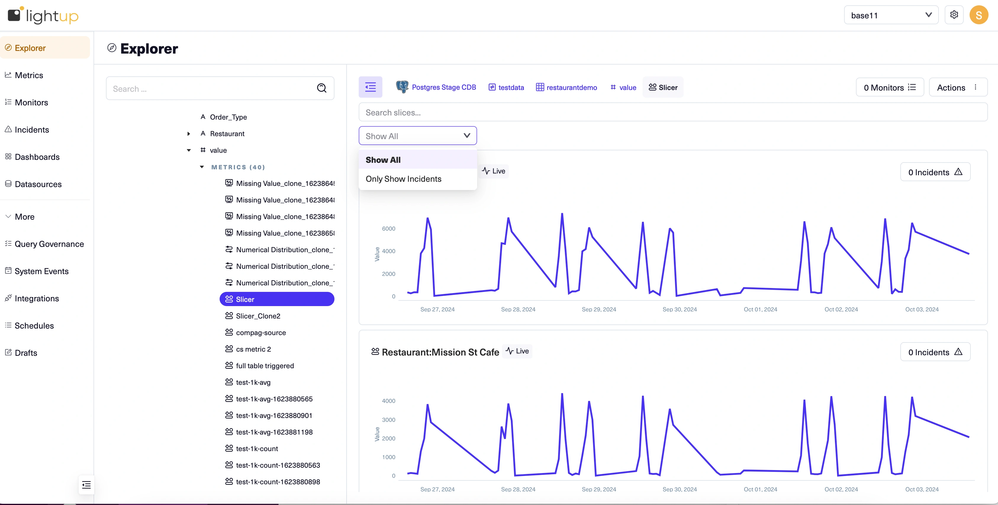
Sliced charts
If a metric has slices, its chart is sliced as well. When you select a sliced metric in Explorer:
- Each chart slice has its own Incidents menu.
- Because the slices all share the same metric and monitors, the Monitors menu and the Actions menu appear above the chart slices, to the right of the metric's breadcrumb.
- Below the breadcrumb, you can use the search box to find and select slices to focus on.
- Below the search box, you can filter to only show slices with incidents.
Updated 11 months ago