
Data Quality dashboards
Each workspace has a Data Quality dashboard to help you assess the health of the workspace's data assets.
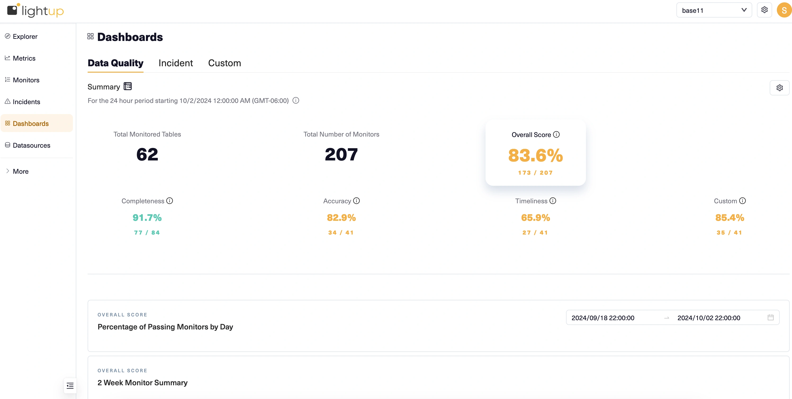
Summary
At the top, the Summary section has scores representing the current percentage of monitors that have no incidents, overall and by data quality dimension. By default, these scores represent the most recent 24-hour period (12AM - 11:59:59 PM, in UTC by default), ignoring data within the last hour (the default Evaluation Delay).
Change the evaluation period
Click the gear icon to open the Settings pane, where you can change the Timezone and Evaluation Delay used for calculating scores. For example, you might want to set Timezone to your current local time zone, and add a longer evaluation delay to make sure all your metrics have collected data for the desired period.
Filter the DQ dashboard
The Settings pane also lets you add filters, by datasource and by incident status. When you filter by datasource, monitors from other datasources are not included in calculating the scores, changing the total number of monitors (the denominator of the scores).
When you filter by incident status, incidents with other statuses do not cause their monitors to fail. This can change the number of monitors that pass, but doesn't affect the total number of monitors. For example, if you filter by all the incident statuses except Rejected and Closed, monitors that only have rejected or closed incidents will pass.
History
Below the Summary, charts display a history of data quality. When the Overall summary score is selected, these charts include data for all data quality dimensions. Choose a dimension summary score to see just its history instead. Note that a score of N/A means there are no monitors on metrics for that dimension— you can't select a score of N/A. Also note that any filters you apply can change which monitors are counted and which incidents cause monitors to count as failed.
- Percentage of passing monitor by day displays a line graph showing two weeks' history of the currently selected summary score. A monitor passes if it logs no incidents; a monitor has failed as soon as it logs an incident. The Y-axis values automatically adjust to the range of displayed values.
- 2-Week Monitor Summary shows a table of failed monitors, with columns for monitor, metric, and a heat map of incidents. On the heat maps, red cells indicate days where monitors had failures, and gray cells indicate days when no monitors failed. Up to ten failing monitors are listed, ordered by the count of days having at least one logged incident.

Updated 10 months ago